Obviously, one of the most appealing aspects of postage stamps is their design. Thousands of different designs have been created since the issuing of the first stamp in 1840 by Great Britain, which depicted a bust of Queen Victoria. What is involved in choosing a design? Well, different things come into consideration.
First of all, the fundamental purpose of a postage stamp is to show the prepaid value of its shipping service, therefore stamps need to show a denomination. Very rarely in history has the denomination been left off of a stamp. Some examples however, are the stamps issued by China during the upheavals in that country in 1949. Since they did not carry a value, the price of the stamp could fluctuate daily depending on the value of the gold Yuan.
As well, certain established rules exist. For example: international agreements require a country name on most stamps. The exception to this rule are the stamps of the United Kingdom, which are not required to carry the country’s name since the UK was the first nation in the world to issue stamps. Usually it is the country’s full name which is printed, but occasionally shorter forms or abbreviations are employed. One example of this is the Republic of South Africa which used the shorter form «RSA».
A graphic design is a commonality in postage stamps, not only does it make them more attractive, but it can make counterfeiting more difficult, and allow for quick recognition. Let’s face it, it’s one of the things we most look forward to seeing when purchasing newly issued stamps. In fact, it is reported that in 1841, a woman in England put a notice in the London Times asking for postage stamps with which she could wallpaper her bedroom! Earlier postage stamps typically showed a bust or profile of the reigning monarch or sovereign. All British stamps from 1840-1900 show the same profile bust of Queen Victoria-she was the only subject allowed on their stamps for 60 years. In the U.S.A. from 1908-1919, the only portraits on American stamps were those of George Washington or Benjamin Franklin. In modern times, graphic design of stamps has progressed to literally creating little works of art. There have been a few failures though. One notable example is the US anti-alcoholism stamp. This stamp simply displayed the slogan «Alcoholism: You Can Beat It! », which, stuck to the corner of an envelope seemed to suggest that the recipient of the mailing was specifically in need of the encouragement! Few used the stamp, even though it was for a noble cause.
Some Notable Canadian Stamp Designs
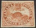
 The 1851 Three pence Beaver This first Canadian postage stamp represents a beaver in an oval frame. In fact, it was the world’s first official postage stamp to picture an animal.
The 1929 Bluenose
This 50-cent definitive depicts the schooner «Bluenose» racing off Halifax Harbour. Many consider it to be the most beautiful, classic stamp in the world. It has an estimated value of $700 depending on grading.
 The 1897 Newfoundland Mining
This 5¢ violet Newfoundland stamp is the first one in the world to depict mining as a subject.
Special thanks to Lisa for her contribution.


Mr. Arpin, thankyou for the articles. They are very informative. I just purchased my 8 year old grandson his 1st stamp album. I am going to help him start collecting stamps. Articles like you printed will help me give him information about the history of stamps and collecting them. thanks….